 “I think this is the best first Visual Arts show that we’ve had,” exclaimed Peter, a senior art student at Idyllwild Arts. “A lot of new students came to our school, and they were already good.”
Today (Oct. 28) is the last day of the “Parents Weekend Student Art Show” at the Parks Exhibition Center on the Idyllwild Arts campus. The show is free and open to the public from 10 a.m. to 5 p.m.
Jane agreed with Peter about the show.
“Last year, we weren’t ready, and kind of rushed our projects during the last two hours or so,” Jane said. “This year, we all planned ahead, and it shows.”
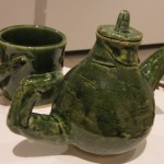
Jane’s tea pot and cup aren’t your garden variety set. Her green, multi-layered glaze draws you over. At closer inspection, you see that the handles of the cup and pot are made up of human fingers. Even the spout is a finger.
It’s a little unsettling since we’re getting so close to Halloween. But my guess is that Jane was not going for the grotesque, but something deeper about the human condition.
Some of the new students that Peter and Jane might be talking about include: Yixuan known as “Maisie,” a 9th grader; Neil, another 9th grader and Niger and Dean, both 10th graders. Each has shown early mastery of their particular mediums.
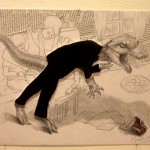
Maisie’s drawing of a raptor or a large lizard in drag “pops” from the center of the page, while newsprint and a line drawing of a mother and child are in the background.
This was likely a drawing exercise using established media, such as newsprint or magazine cut -outs. Yet, it’s more than the raptor from a book coming to life before them.
Why is the raptor hostile, and wearing a black suit? It could be a commentary on a teacher, parent or other adult figure.
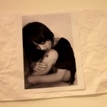
You have to look for subtleties to get the bigger picture of what Niger is trying to say. His black-and-white photo of a young Asian woman is physically appealing. It shows good composition and contrast. However, it’s attached to white paper that’s been crumpled and smoothed over.
And the woman is shown licking a cut on her knee.
Is Niger trying to tell the story of violence in this young woman’s life? Or is he talking about violence against women in general?
Another promising young visual artist is Neil, whose father works in the Transportation department.
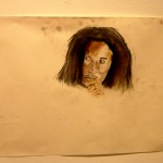
Neil’s drawing of Bob Marley, the enduring symbol of anti-culture is also compelling in its composition. It depicts a portrait of the musician’s face and hands, yet it is placed off center.
“I should have trimmed it off,” Neil said later.
Yet, his use of excessive white space is interesting. In any given picture, your eyes automatically go to the light, or the whitest part of the painting. Like looking at a candle in a dark room. However, when you have more white space than dark, your eye is drawn to the dark. Sort of like seeing a bowling ball in the snow.
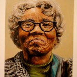
Dean’s painting of an older black woman shows great use of color, texture, detail and reflection. The detail on her gray hair looks nearly like a photograph. And the reflection in her cat-eye glasses show good handling of the paint. Oftentimes, you see reflections in glasses in photographs, but they are omitted in paintings.
It’s hard to say where he got the photo. If he took it himself, or found it online. Yet, the closeness of the taker to the subject shows intimacy. Even the elderly woman’s smile was just starting to form when the photo was taken. It was as if the photographer was young or inexperience in taking photos. Yet, the image is sweet, typical Americana from the 1950s.
Yep, the new visual artists are good, but the seniors still need to be reckoned with, namely Jimmie and Delaney.
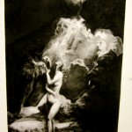
Jimmie’s image of a nude woman looking towards the light in the heavens looks like the church paintings from the Old Masters, such as Caravaggio. He was known for emotional depictions of humans using dramatic light.
You can tell that Jimmie spent many hours adding layers of charcoal until it looked like night.
It’s interesting that he used only black and shades of gray to depict this image. If it were the Old Masters, there would be all kinds of colors, and about 40 other people in the picture, including angels.
Later on, Jimmie said that Caravaggio wasn’t so much an inspiration, but the drawing started looking like one of his, so he made the lighting more dramatic.
Yet, the way that Jimmie does it, makes you want to spend a few hours looking it over.
“I like Rei’s painting because it looks simple, but it’s really complex,” said Peter.
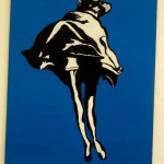
Rei’s black-and-white image engulfed in blue looked abstract to me at first. Such as a rock or a crumpled piece of paper.
Yet, at closer inspection, I saw women’s legs in heels, and remembered that Rei is studying fashion. Then it looked like the woman in heels was walking towards the viewer, and was putting on or taking off a large cape. But then attached to the top of the cap was an animal head, such as a Halloween costume.
Knowing that Rei is a deep thinker, I doubt if he did a painting of a woman taking off a Halloween costume. Perhaps his painting is also a commentary on the human condition.
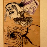
Delaney’s drawing of two heads in distress was intriguing. How she accurately portrays her subjects looking up and looking down is amazing. If you’ve ever tried to draw them, its difficult to get the perspective, and make it look realistic, yet Delaney makes it look easy.
The final image that I looked at in this show was a headset on a pedestal. Next to the disc player was a list of five student names, including Peter, Jimmie, Jessica, Kevin and Rei.
“It was selections from our ‘New Genre’s’ class,” Peter explained. “We just mixed some music from a software program according to a title, such as ‘summer’ or ‘winter.'”
Most of their music selections included new age music with some sound effects. For example, Kevin’s “summer” selection featured kids laughing, while Jessica’s “winter” had footsteps crunching in the snow.
But how does the music tie into visual art?
“Do you know sometimes there’s a part in a painting that looks like a piece is missing?” Peter said. “Well, you can fill that void with music.”
Student Visual Art Show ends today, Friday, Oct. 28 at the Parks Exhibition Center on the Idyllwild Arts campus. Gallery hours are from 10 a.m. to 5 p.m. The show is free and open to the public.
Copyright 2011 Idyllwild Me. All rights reserved.
Published on: Oct 28, 2011 @ 12:38
the attachments to this post:


